Monday, 12 November 2012

Angles and Shots


This is a low angle. It can be used to convey power or make the person or object in shot look larger than they normally are. It puts people in a position of dominance, whereas the high angle puts people into a position of weakness.


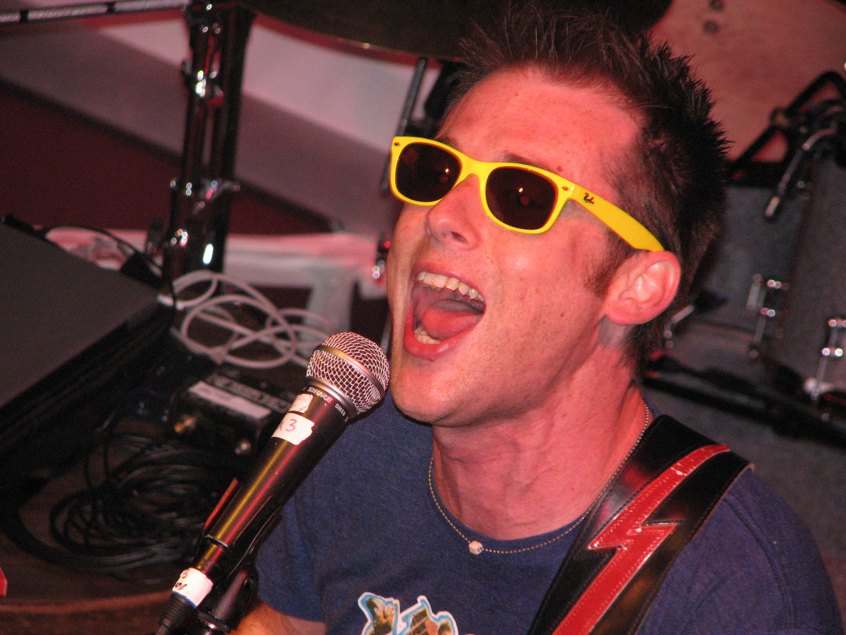
This is a medium close up. These are used to show half of the body, more importantly, the persons face. This is so we can see their facial expression and any distinguishing features they have on their face.


This is a long shot of my model. Long shots are normally used in conjunction with the idea of showing a background and will sometimes show a skyline in the top of the image. Also, the features of the person in shot tend to be hard to distinguish due to the distance.


This is a high angle. It is normally used to show that the person in frame is small or convey that they have little or no dominance. It puts people into a position of vulnerability compared to the high angle putting the person in power.


This is a close up. This is normally to focus purely on an object or a specific part of somebody, such as their hand or their face. it is to show us in more detail what we are looking at and makes it easier to see what message is being conveyed. this example focuses on a sign and could be an eyeline match or a point of view of what somebody is looking at.

Wednesday, 7 November 2012

Spider Diagram


FC Text Boxes


This is the front cover i made usinjg text boxes. It is a rough idea but allows me to consider the positioning of the person in the image.


Focus Groups

During our focus groups, we did two videos. One where we asked another group questions, and the second where we had a big group discusssion.


Big group discussion


Asking another group qluestions

Tuesday, 6 November 2012

Music Magazine ideas


Recently I have been considering what my music magazine should cover. There are alot of genres to consider: rock, metal, pop, western, rap... the list is endless. One thought that jumps to mind though is the rising popularity of technology. In day to day life we use the internet everyday for entertainment, but also music. One thing that comes to mind is the lack of attention musicians recieve just because they are just youtubers trying to make a living.

This brings me to my magazine idea. The magazine could be called E-Music and could cover what's trending on youtube, such as Psy's Gangnam style, or hit musicians such as Nicepeter or Watsky. The tagline for the magazine could be "Connected to Music" and could be a great multigenre magazine that everybody could relate to. Freebies such as merchandise the musicians make could be up for grabs, or atleast maybe an opportunity to win some. There could be a variety of posters, articles and news all different genres, but all balanced by the popularity of the online world.
                      Above is Nicepeter, creator of Epic Rap Battles of History and his own original music.

I will edit this post with more ideas in the coming days.

           
Shaun

Final Front Cover


This is my final front cover for my college magazine.


Thursday, 18 October 2012

Evaluation


Liarr of my cover

Throughout the creation of the front page, I had to consider a lot of things. Firstly, the use of my image. I wanted the theme of the issue to focus on the gamers in the college environment, and so I donned my gaming related hoodie and asked for my picture to be taken. I made myself look relaxed in the picture as I wanted to convey the casual side of gaming on the cover, and not show gamers as their stereotypes.

The language of my front cover shows that the issue focuses on the gaming side of the college community. This is shown by the hoodie I am wearing in the picture. Also, to further show what the issue focuses on, I am centre frame and cover most of the shot showing that this is what is featured.  Also, I framed myself using the doors of Ash building to further enforce what the issue is about.

The institution is the “Student Life” magazine which was devised by myself. Of course this is shown by the title atop the page.

The ideology or message I am trying to convey is that gamers are just as normal as anybody else, and that they are not the stereotypical antisocial community they are made out to be. By choosing a place with artwork above me, I am showing that I am just like any other person, and that games can in fact be considered a work of art.

The audience is to a student at a college. The name of the magazine is one factor to show this, and a couple of other factors including the mention of coursework on the side with the features, and the use of a college building. The age group would be 16-20 due to this target audience.

I have represented myself as a stereotype of a gamer in the sense that I am wearing a gaming hoodie, but at the same time I am breaking conventions. By making myself look dominant and by cracking a smile, I am breaking the idea of an antisocial gamer who sits in the dark.

In conclusion I feel I have conveyed my theme across well and made a decent front cover. I am disappointed with my contents and wasn’t very organised with the planning. In response to this I feel I could improve myself in my next project.

Contents Page


This is my draft for my contents page. The background didn't come out as i wanted it to, but i am happy with my choice of colours ( as it relates to gaming/xbox).


Mood Board

Mood board of magazines, my interests and college: the foundations of my college magazine.

Preliminary Original Images


These are the images i took for my preliminary task. I took a variety of images to cover any purpose i may have needed. Some are of life within college, and some are of life out of college.